overseas shipping
software service
Navlungo’s logo used to be a container icon. Without
losing the container appearance, we redesigned it to
represent the brand more. This resulted in a structure
that evokes digital screens, progress, and international
logistics simultaneously. We used the golden ratio in
designing the logo, intending for there to be a
mathematical foundation behind most of our designs.
Moreover, to maintain the logo’s freshness in branding, we
created a distinctive style using colorful noisy shapes
that will always represent Navlungo, everywhere.
We adopted a typeface from Google’s open-source Lexend
family and gently refined its edges. Throughout this
process, we maintained proportional harmony with the
Parkpalet’s logo. We diligently worked on aligning both
logos vertically and horizontally to ensure a cohesive
visual. Additionally, we carefully selected color palettes
that complemented each other, allowing the two brands to
collaborate seamlessly. As a result, we’re delighted to
have achieved a solid, flat, and timeless logo and visual
brand identity.
end-to-end fulfillment and warehousing service
We took inspiration from the old logo’s two-dimensional
boxes to rebrand Parkpalet. Initially, we had a tesseract
in mind, but later consider for an isometric box encircled
by a placeholder, symbolizing a warehouse company that
houses boxes in diverse global locations. We adopted a
typeface from Google’s open-source Lexend family and
gently refined its edges. Throughout this process, we
maintained proportional harmony with the Navlungo’s logo.
We diligently worked on aligning both logos vertically and
horizontally to ensure a cohesive visual. Additionally, we
carefully selected color palettes that complemented each
other, allowing the two brands to collaborate seamlessly.
As a result, we’re delighted to have achieved a solid,
flat, and timeless logo and visual brand identity.
assertive gastropub with coffee, cocktails and food
We made a deep branding with working together. The name
coming from the song of The Beatles. While we working on
this project we listened this song countless times. And we
aimed to approach this feeling to work.
live streaming supported fitness lesson app
We are so exciting to announce that we have created this
work with monaxe. Thanks for monaxe’s passion to push us
on creative progress. We are gonna take this a higher
place in the future. Just keeping it up!
english language
education course
We specifically wanted the logo to be an elegant and
handwritten logotype. Their constant encounters with a
single and borderless figure will inspire our students to
cross boundaries. We aimed for a spacious and serene
atmosphere with warm sunset colors so that it would also
express the serenity of our working environments.
sport club
and academy
Let’s Club is a sports and fitness center located in
Ataşehir, Istanbul. With its new branding, it represents
dynamism, consistency, a DNA structure, resolute gazes,
and infinite possibilities. The energetic yellow color and
the logo spreading all over the facility fill us with
pride and remind us of the brand itself every time we look
at it.
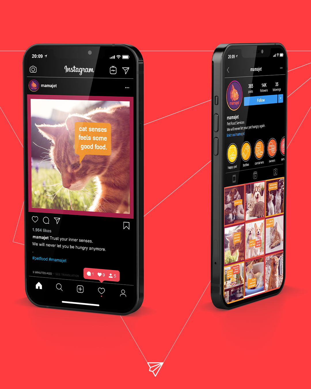
quick food
service to pets
Fırat Makar asked us to draw a logo of an application that
will be a service provider for pet food. First we thought
of the cartoon Heathcliff; A cat on a rocket carries food.
Then we decided it couldn’t be an original idea and
changed the thinking. We were going to make the rocket
itself a cat. After many trials, mamajet’s logo appeared.
It’s one of our favorite works.
coffee shop with a wide variety of coffee beans
The story behind the logo is so deep cause Misk (Luwak)
Cat is known for quality coffee choices. So logo came with
that. After logo has revealed, we digitally painted
planets for each coffee beans. Then the slogan showed up:
“The best coffee bean of any planet!”